Matplotlib#
Matplotlib is a powerful package (and now de standard) for plotting in both 2D and 3D in Python. In this notebook we will learn the basics on how to plot with matplotlib. (This is based on the Scipy tutorial, and the Introduction to Scientific Computing with Python by Johansson)
NOTE : the pylab mode for ipython is designed to expose the numpy and matplotlib namespace, making easier to use the environment. But, it is recommended to keep the modules names isolated, so we will try to use the pyplot submodule as possible. To use pylab, you can start ipython with the
--pylabflag.
NOTE : We want to produce inline figures inside the notebook. Therefeore, we use the following magic function
%matplotlib inline
A simple example#
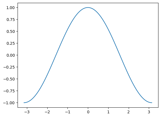
Let’s start plotting by using a simple example with the defaults.
import matplotlib.pyplot as plt
import numpy as np
X = np.linspace(-np.pi, np.pi, 256, endpoint=True)
C= np.cos(X)
plt.plot(X, C)
plt.show() # not necessarily needed
help(plt.plot)
Help on function plot in module matplotlib.pyplot:

plot(*args: 'float | ArrayLike | str', scalex: 'bool' = True, scaley: 'bool' = True, data=None, **kwargs) -> 'list[Line2D]'
    Plot y versus x as lines and/or markers.

    Call signatures::

        plot([x], y, [fmt], *, data=None, **kwargs)
        plot([x], y, [fmt], [x2], y2, [fmt2], ..., **kwargs)

    The coordinates of the points or line nodes are given by *x*, *y*.

    The optional parameter *fmt* is a convenient way for defining basic
    formatting like color, marker and linestyle. It's a shortcut string
    notation described in the *Notes* section below.

    >>> plot(x, y)        # plot x and y using default line style and color
    >>> plot(x, y, 'bo')  # plot x and y using blue circle markers
    >>> plot(y)           # plot y using x as index array 0..N-1
    >>> plot(y, 'r+')     # ditto, but with red plusses

    You can use `.Line2D` properties as keyword arguments for more
    control on the appearance. Line properties and *fmt* can be mixed.
    The following two calls yield identical results:

    >>> plot(x, y, 'go--', linewidth=2, markersize=12)
    >>> plot(x, y, color='green', marker='o', linestyle='dashed',
    ...      linewidth=2, markersize=12)

    When conflicting with *fmt*, keyword arguments take precedence.


    **Plotting labelled data**

    There's a convenient way for plotting objects with labelled data (i.e.
    data that can be accessed by index ``obj['y']``). Instead of giving
    the data in *x* and *y*, you can provide the object in the *data*
    parameter and just give the labels for *x* and *y*::

    >>> plot('xlabel', 'ylabel', data=obj)

    All indexable objects are supported. This could e.g. be a `dict`, a
    `pandas.DataFrame` or a structured numpy array.


    **Plotting multiple sets of data**

    There are various ways to plot multiple sets of data.

    - The most straight forward way is just to call `plot` multiple times.
      Example:

      >>> plot(x1, y1, 'bo')
      >>> plot(x2, y2, 'go')

    - If *x* and/or *y* are 2D arrays, a separate data set will be drawn
      for every column. If both *x* and *y* are 2D, they must have the
      same shape. If only one of them is 2D with shape (N, m) the other
      must have length N and will be used for every data set m.

      Example:

      >>> x = [1, 2, 3]
      >>> y = np.array([[1, 2], [3, 4], [5, 6]])
      >>> plot(x, y)

      is equivalent to:

      >>> for col in range(y.shape[1]):
      ...     plot(x, y[:, col])

    - The third way is to specify multiple sets of *[x]*, *y*, *[fmt]*
      groups::

      >>> plot(x1, y1, 'g^', x2, y2, 'g-')

      In this case, any additional keyword argument applies to all
      datasets. Also, this syntax cannot be combined with the *data*
      parameter.

    By default, each line is assigned a different style specified by a
    'style cycle'. The *fmt* and line property parameters are only
    necessary if you want explicit deviations from these defaults.
    Alternatively, you can also change the style cycle using
    :rc:`axes.prop_cycle`.


    Parameters
    ----------
    x, y : array-like or float
        The horizontal / vertical coordinates of the data points.
        *x* values are optional and default to ``range(len(y))``.

        Commonly, these parameters are 1D arrays.

        They can also be scalars, or two-dimensional (in that case, the
        columns represent separate data sets).

        These arguments cannot be passed as keywords.

    fmt : str, optional
        A format string, e.g. 'ro' for red circles. See the *Notes*
        section for a full description of the format strings.

        Format strings are just an abbreviation for quickly setting
        basic line properties. All of these and more can also be
        controlled by keyword arguments.

        This argument cannot be passed as keyword.

    data : indexable object, optional
        An object with labelled data. If given, provide the label names to
        plot in *x* and *y*.

        .. note::
            Technically there's a slight ambiguity in calls where the
            second label is a valid *fmt*. ``plot('n', 'o', data=obj)``
            could be ``plt(x, y)`` or ``plt(y, fmt)``. In such cases,
            the former interpretation is chosen, but a warning is issued.
            You may suppress the warning by adding an empty format string
            ``plot('n', 'o', '', data=obj)``.

    Returns
    -------
    list of `.Line2D`
        A list of lines representing the plotted data.

    Other Parameters
    ----------------
    scalex, scaley : bool, default: True
        These parameters determine if the view limits are adapted to the
        data limits. The values are passed on to
        `~.axes.Axes.autoscale_view`.

    **kwargs : `~matplotlib.lines.Line2D` properties, optional
        *kwargs* are used to specify properties like a line label (for
        auto legends), linewidth, antialiasing, marker face color.
        Example::

        >>> plot([1, 2, 3], [1, 2, 3], 'go-', label='line 1', linewidth=2)
        >>> plot([1, 2, 3], [1, 4, 9], 'rs', label='line 2')

        If you specify multiple lines with one plot call, the kwargs apply
        to all those lines. In case the label object is iterable, each
        element is used as labels for each set of data.

        Here is a list of available `.Line2D` properties:

        Properties:
        agg_filter: a filter function, which takes a (m, n, 3) float array and a dpi value, and returns a (m, n, 3) array and two offsets from the bottom left corner of the image
        alpha: float or None
        animated: bool
        antialiased or aa: bool
        clip_box: `~matplotlib.transforms.BboxBase` or None
        clip_on: bool
        clip_path: Patch or (Path, Transform) or None
        color or c: :mpltype:`color`
        dash_capstyle: `.CapStyle` or {'butt', 'projecting', 'round'}
        dash_joinstyle: `.JoinStyle` or {'miter', 'round', 'bevel'}
        dashes: sequence of floats (on/off ink in points) or (None, None)
        data: (2, N) array or two 1D arrays
        drawstyle or ds: {'default', 'steps', 'steps-pre', 'steps-mid', 'steps-post'}, default: 'default'
        figure: `~matplotlib.figure.Figure` or `~matplotlib.figure.SubFigure`
        fillstyle: {'full', 'left', 'right', 'bottom', 'top', 'none'}
        gapcolor: :mpltype:`color` or None
        gid: str
        in_layout: bool
        label: object
        linestyle or ls: {'-', '--', '-.', ':', '', (offset, on-off-seq), ...}
        linewidth or lw: float
        marker: marker style string, `~.path.Path` or `~.markers.MarkerStyle`
        markeredgecolor or mec: :mpltype:`color`
        markeredgewidth or mew: float
        markerfacecolor or mfc: :mpltype:`color`
        markerfacecoloralt or mfcalt: :mpltype:`color`
        markersize or ms: float
        markevery: None or int or (int, int) or slice or list[int] or float or (float, float) or list[bool]
        mouseover: bool
        path_effects: list of `.AbstractPathEffect`
        picker: float or callable[[Artist, Event], tuple[bool, dict]]
        pickradius: float
        rasterized: bool
        sketch_params: (scale: float, length: float, randomness: float)
        snap: bool or None
        solid_capstyle: `.CapStyle` or {'butt', 'projecting', 'round'}
        solid_joinstyle: `.JoinStyle` or {'miter', 'round', 'bevel'}
        transform: unknown
        url: str
        visible: bool
        xdata: 1D array
        ydata: 1D array
        zorder: float

    See Also
    --------
    scatter : XY scatter plot with markers of varying size and/or color (
        sometimes also called bubble chart).

    Notes
    -----

    .. note::

        This is the :ref:`pyplot wrapper <pyplot_interface>` for `.axes.Axes.plot`.

    **Format Strings**

    A format string consists of a part for color, marker and line::

        fmt = '[marker][line][color]'

    Each of them is optional. If not provided, the value from the style
    cycle is used. Exception: If ``line`` is given, but no ``marker``,
    the data will be a line without markers.

    Other combinations such as ``[color][marker][line]`` are also
    supported, but note that their parsing may be ambiguous.

    **Markers**

    =============   ===============================
    character       description
    =============   ===============================
    ``'.'``         point marker
    ``','``         pixel marker
    ``'o'``         circle marker
    ``'v'``         triangle_down marker
    ``'^'``         triangle_up marker
    ``'<'``         triangle_left marker
    ``'>'``         triangle_right marker
    ``'1'``         tri_down marker
    ``'2'``         tri_up marker
    ``'3'``         tri_left marker
    ``'4'``         tri_right marker
    ``'8'``         octagon marker
    ``'s'``         square marker
    ``'p'``         pentagon marker
    ``'P'``         plus (filled) marker
    ``'*'``         star marker
    ``'h'``         hexagon1 marker
    ``'H'``         hexagon2 marker
    ``'+'``         plus marker
    ``'x'``         x marker
    ``'X'``         x (filled) marker
    ``'D'``         diamond marker
    ``'d'``         thin_diamond marker
    ``'|'``         vline marker
    ``'_'``         hline marker
    =============   ===============================

    **Line Styles**

    =============    ===============================
    character        description
    =============    ===============================
    ``'-'``          solid line style
    ``'--'``         dashed line style
    ``'-.'``         dash-dot line style
    ``':'``          dotted line style
    =============    ===============================

    Example format strings::

        'b'    # blue markers with default shape
        'or'   # red circles
        '-g'   # green solid line
        '--'   # dashed line with default color
        '^k:'  # black triangle_up markers connected by a dotted line

    **Colors**

    The supported color abbreviations are the single letter codes

    =============    ===============================
    character        color
    =============    ===============================
    ``'b'``          blue
    ``'g'``          green
    ``'r'``          red
    ``'c'``          cyan
    ``'m'``          magenta
    ``'y'``          yellow
    ``'k'``          black
    ``'w'``          white
    =============    ===============================

    and the ``'CN'`` colors that index into the default property cycle.

    If the color is the only part of the format string, you can
    additionally use any  `matplotlib.colors` spec, e.g. full names
    (``'green'``) or hex strings (``'#008000'``).
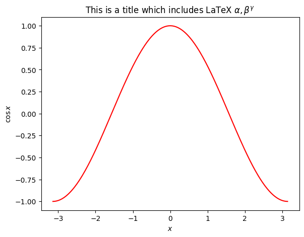
# The object oriented way
fig = plt.figure()
axes = fig.add_axes([0.1, 0.1, 0.8, 0.8])
axes.plot(X, C, 'r')
axes.set_xlabel(r'$x$')
axes.set_ylabel(r'$\cos x$')
axes.set_title(r"This is a title which includes LaTeX $\alpha, \beta^\gamma$")
Text(0.5, 1.0, 'This is a title which includes LaTeX $\\alpha, \\beta^\\gamma$')
# The object oriented way
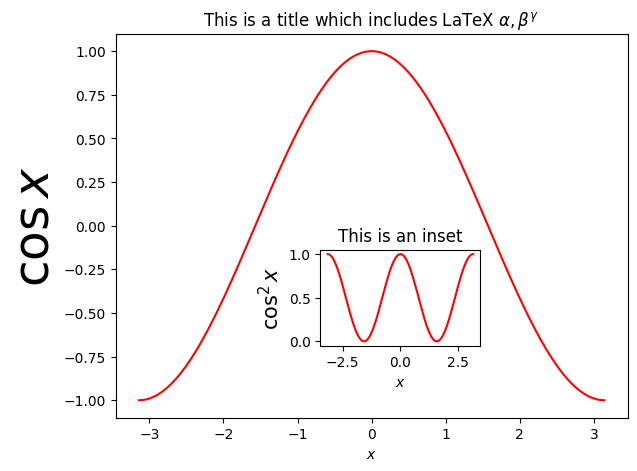
fig = plt.figure()
axes1 = fig.add_axes([0.1, 0.1, 0.8, 0.8])
axes1.plot(X, C, 'r')
axes1.set_xlabel(r'$x$')
axes1.set_ylabel(r'$\cos x$', fontsize=35)
axes1.set_title(r"This is a title which includes LaTeX $\alpha, \beta^\gamma$")
axes2 = fig.add_axes([0.42, 0.25, 0.25, 0.2])
axes2.plot(X, C*C, 'r')
axes2.set_xlabel(r'$x$')
axes2.set_ylabel(r'$\cos^2 x$', fontsize=15)
axes2.set_title(r"This is an inset")
Text(0.5, 1.0, 'This is an inset')
import matplotlib.pyplot as plt
import numpy as np
X = np.linspace(-np.pi, np.pi, 256, endpoint=True)
C, S = np.cos(X), np.sin(X)
plt.plot(X, C)
plt.plot(X, S)
plt.show() # not necessarily needed

As you can see, there are several defaults employed: the type of data plotting (lines), the color (blue and then green), the axis sizes, no labels, no legends, etc. Now let’s start modifying some settings.
Changing colors, widths, and adding legends#
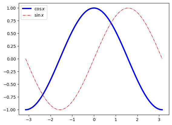
plt.plot(X, C, color='blue', linewidth=3.0, linestyle='-', label=r"$\cos x$") # linewidth -> lw , linestyle -> ls
plt.plot(X, S, color='red',  lw=1.0, ls='-.', label=r"$\sin x$")
plt.legend() # there are several codes for different locations. Search on google.
<matplotlib.legend.Legend at 0x7f1afcb05f50>
plt.plot(X, C, color='#eeefff', lw=3.0, ls='-') # html string
plt.plot(X, S, color='0.45',  lw=4.0, ls='-.') # gray scale
[<matplotlib.lines.Line2D at 0x7f1afc8057d0>]
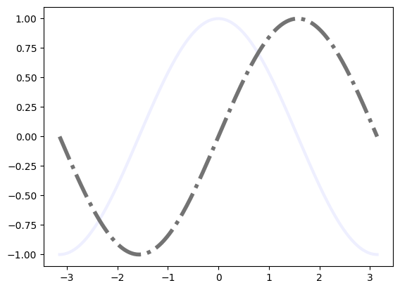
There are more standard color : red, cyan, magenta, yellow, black, white. Actually, matplotlib can use a full range of html colors and even more! Check Matplotlib colors.
Exercise: Re-plot the previous data with several different colors and palettes. Share your plots with your classmates.
Changing the figure size and resolution#
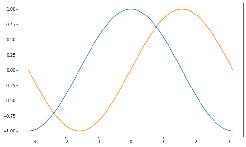
plt.figure(figsize=(10, 6), dpi=60)
plt.plot(X, C)
plt.plot(X, S)
plt.show()
Saving the figure to a filename#
You can save your plots into filename with suitable formats. It is recommended for you to use the vector graphics formats, like svg, pdf, or pdf, and to avoid bitmap formats. If you must have a bitmap, select the png format with a good dpi.
plt.plot(X, C)
plt.plot(X, S)
plt.savefig("filename.pdf", dpi=200)

Setting limits#
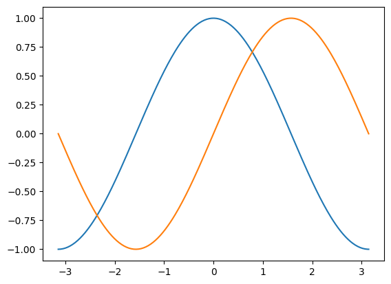
plt.xlim(X.min()*1.1, X.max()*1.1)
plt.ylim(C.min()*1.1, C.max()*1.1)
plt.plot(X, C)
plt.plot(X, S)
[<matplotlib.lines.Line2D at 0x7f1afc11ddd0>]
Setting tics#
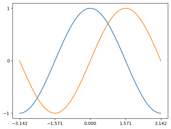
Let’s change the xtics to show \(\pi\) related values, which are more intereting.
plt.xticks([-np.pi, -np.pi/2, 0, np.pi/2, np.pi])
plt.yticks([-1, 0, 1])
plt.plot(X, C)
plt.plot(X, S)
[<matplotlib.lines.Line2D at 0x7f1afc186690>]
Setting tics labels#
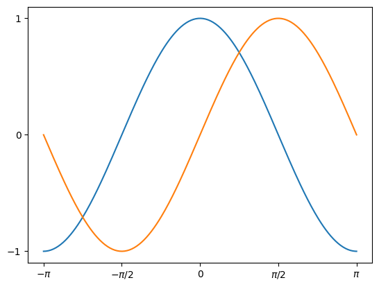
Instead of -3.142, it woul be better to have the symbol \(\pi\), right?
plt.xticks([-np.pi, -np.pi/2, 0, np.pi/2, np.pi], ['$-\pi$', '$-\pi/2$', 0, '$\pi/2$', '$\pi$'])
plt.yticks([-1, 0, 1])
plt.plot(X, C)
plt.plot(X, S)
[<matplotlib.lines.Line2D at 0x7f1af5f0d110>]
Figures#
A figure, in matplotlib, means the whole window. Therefire, you can have several plots (subplots) on a single figure (window). For this we will need to explicitly use figures and axes, in constrast with the majority of the examples previosuly shown. Remember that the function gca() returns the current axes, while gcf() returns the current figure.
Figures are numbered starting from 1 ! .
Exercise: Please check the documentation explain the following parameters for a figure:
num, figsize, dpi, facecolor, edgecolor, frameon.
You can use plt.close() to close a figure programatically.
Subplots#
Subplots are a way to organize several plots on a figure, using a grid. You have to specify the rows and columns. For more complex grids, you can use the gridspec command.
from IPython.core.display import Image
Image(filename='subplots.png')
---------------------------------------------------------------------------
FileNotFoundError                         Traceback (most recent call last)
Cell In[14], line 2
      1 from IPython.core.display import Image
----> 2 Image(filename='subplots.png')

File /opt/hostedtoolcache/Python/3.11.13/x64/lib/python3.11/site-packages/IPython/core/display.py:1025, in Image.__init__(self, data, url, filename, format, embed, width, height, retina, unconfined, metadata, alt)
   1023 self.unconfined = unconfined
   1024 self.alt = alt
-> 1025 super(Image, self).__init__(data=data, url=url, filename=filename,
   1026         metadata=metadata)
   1028 if self.width is None and self.metadata.get('width', {}):
   1029     self.width = metadata['width']

File /opt/hostedtoolcache/Python/3.11.13/x64/lib/python3.11/site-packages/IPython/core/display.py:343, in DisplayObject.__init__(self, data, url, filename, metadata)
    340 elif self.metadata is None:
    341     self.metadata = {}
--> 343 self.reload()
    344 self._check_data()

File /opt/hostedtoolcache/Python/3.11.13/x64/lib/python3.11/site-packages/IPython/core/display.py:1060, in Image.reload(self)
   1058 """Reload the raw data from file or URL."""
   1059 if self.embed:
-> 1060     super(Image,self).reload()
   1061     if self.retina:
   1062         self._retina_shape()

File /opt/hostedtoolcache/Python/3.11.13/x64/lib/python3.11/site-packages/IPython/core/display.py:369, in DisplayObject.reload(self)
    367 if self.filename is not None:
    368     encoding = None if "b" in self._read_flags else "utf-8"
--> 369     with open(self.filename, self._read_flags, encoding=encoding) as f:
    370         self.data = f.read()
    371 elif self.url is not None:
    372     # Deferred import

FileNotFoundError: [Errno 2] No such file or directory: 'subplots.png'
Manipulating several plots#
x = np.linspace(0, 5)
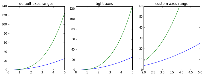
fig, axes = plt.subplots(1, 3, figsize=(12, 4))
axes[0].plot(x, x**2, x, x**3)
axes[0].set_title("default axes ranges")
axes[1].plot(x, x**2, x, x**3)
axes[1].axis("tight")
axes[1].set_title("tight axes")
axes[2].plot(x, x**2, x, x**3)
axes[2].set_ylim([0, 60])
axes[2].set_xlim([2, 5])
axes[2].set_title("custom axes range");
Logarithmic scale#
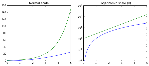
fig, axes = plt.subplots(1, 2, figsize=(10,4))
axes[0].plot(x, x**2, x, np.exp(x))
axes[0].set_title("Normal scale")
axes[1].plot(x, x**2, x, np.exp(x))
axes[1].set_yscale("log")
axes[1].set_title("Logarithmic scale (y)");
Other plotting styles#
n = np.array([0,1,2,3,4,5])
xx = np.linspace(-0.75, 1., 100)
fig, axes = plt.subplots(1, 4, figsize=(12,3))
axes[0].scatter(xx, xx + 0.25*np.random.randn(len(xx)))
axes[0].set_title("scatter")
axes[1].step(n, n**2, lw=2)
axes[1].set_title("step")
axes[2].bar(n, n**2, align="center", width=0.5, alpha=0.5)
axes[2].set_title("bar")
axes[3].fill_between(x, x**2, x**3, color="green", alpha=0.5);
axes[3].set_title("fill_between");

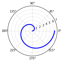
# polar plot using add_axes and polar projection
fig = plt.figure()
ax = fig.add_axes([0.0, 0.0, .6, .6], polar=True)
t = np.linspace(0, 2 * np.pi, 100)
ax.plot(t, t, color="blue", lw=3);
3D figures#
alpha = 0.7
phi_ext = 2 * np.pi * 0.5

def flux_qubit_potential(phi_m, phi_p):
    return 2 + alpha - 2 * np.cos(phi_p)*np.cos(phi_m) - alpha * np.cos(phi_ext - 2*phi_p)

phi_m = np.linspace(0, 2*np.pi, 100)
phi_p = np.linspace(0, 2*np.pi, 100)
X,Y = np.meshgrid(phi_p, phi_m)
Z = flux_qubit_potential(X, Y).T
from mpl_toolkits.mplot3d.axes3d import Axes3D
fig = plt.figure(figsize=(14,6))
# ‘ax‘ is a 3D-aware axis instance because of the projection=’3d’ keyword argument to add_subplot
ax = fig.add_subplot(1, 2, 1, projection='3d')
p = ax.plot_surface(X, Y, Z, rstride=4, cstride=4, linewidth=0)
# surface_plot with color grading and color bar
ax = fig.add_subplot(1, 2, 2, projection='3d')
p = ax.plot_surface(X, Y, Z, rstride=1, cstride=1, cmap=plt.cm.coolwarm, linewidth=0, antialiased=False)
cb = fig.colorbar(p, shrink=0.5)
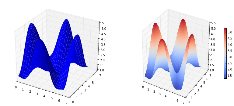
fig = plt.figure(figsize=(8,6))
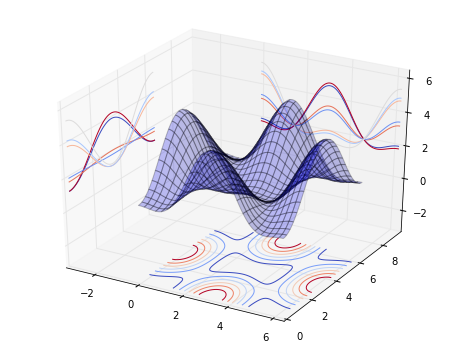
ax = fig.add_subplot(1,1,1, projection='3d')
ax.plot_surface(X, Y, Z, rstride=4, cstride=4, alpha=0.25)
cset = ax.contour(X, Y, Z, zdir='z', offset=-np.pi, cmap=plt.cm.coolwarm)
cset = ax.contour(X, Y, Z, zdir='x', offset=-np.pi, cmap=plt.cm.coolwarm)
cset = ax.contour(X, Y, Z, zdir='y', offset=3*np.pi, cmap=plt.cm.coolwarm)
ax.set_xlim3d(-np.pi, 2*np.pi);
ax.set_ylim3d(0, 3*np.pi);
ax.set_zlim3d(-np.pi, 2*np.pi);
Animations#
To create animations, you can use the FuncAnimation function which can generate a movie of files from sequences of figures. You have to define an init function, which starts the animation sequence, and an update function, which updates the canvas. The general structure is
def init():
    # setup figure

def update(frame_counter):
    # update figure for new frame

anim = animation.FuncAnimation(fig, update, init_func=init, frames=200, blit=True)

anim.save("animation.mp4", fps=30) # fps = frames per second
  File "<ipython-input-83-e3a1ffe5ed9e>", line 4
    def update(frame_counter):
      ^
IndentationError: expected an indented block
from matplotlib import animation
from numpy import pi, sin, cos

# double pendulum
from scipy.integrate import odeint
g = 9.82; L = 0.5; m = 0.1
def dx(x, t):
    x1, x2, x3, x4 = x[0], x[1], x[2], x[3]
    dx1 = 6.0/(m*L**2) * (2 * x3 - 3 * cos(x1-x2) * x4)/(16 - 9 * cos(x1-x2)**2)
    dx2 = 6.0/(m*L**2) * (8 * x4 - 3 * cos(x1-x2) * x3)/(16 - 9 * cos(x1-x2)**2)
    dx3 = -0.5 * m * L**2 * ( dx1 * dx2 * sin(x1-x2) + 3 * (g/L) * sin(x1))
    dx4 = -0.5 * m * L**2 * (-dx1 * dx2 * sin(x1-x2) + (g/L) * sin(x2))
    return [dx1, dx2, dx3, dx4]

x0 = [np.pi/2, np.pi/2, 0, 0] # initial state
t = np.linspace(0, 10, 250) # time coordinates
x = odeint(dx, x0, t) # solve the ODE
fig, ax = plt.subplots(figsize=(5,5))
ax.set_ylim([-1.5, 0.5])
ax.set_xlim([1, -1])
pendulum1, = ax.plot([], [], color="red", lw=2)
pendulum2, = ax.plot([], [], color="blue", lw=2)

def init():
    pendulum1.set_data([], [])
    pendulum2.set_data([], [])

def update(n):
    # n = frame counter
    # calculate the positions of the pendulums
    x1 = + L * sin(x[n, 0])
    y1 = - L * cos(x[n, 0])
    x2 = x1 + L * sin(x[n, 1])
    y2 = y1 - L * cos(x[n, 1])
    # update the line data
    pendulum1.set_data([0 ,x1], [0 ,y1])
    pendulum2.set_data([x1,x2], [y1,y2])

anim = animation.FuncAnimation(fig, update, init_func=init, frames=len(t), blit=True)
# anim.save can be called in a few different ways, some which might or might not work
# on different platforms and with different versions of matplotlib and video encoders #anim.save(’animation.mp4’, fps=20, extra_args=[’-vcodec’, ’libx264’], writer=animation.FFMpegWriter()) #anim.save(’animation.mp4’, fps=20, extra_args=[’-vcodec’, ’libx264’])
#anim.save("animation.mp4", fps=20, writer="ffmpeg", codec="libx264")
#anim.save("animation.mp4", fps=20, writer="avconv", codec="libx264")
anim.save("animation.mp4", fps=20)
plt.close(fig)
Exercises#
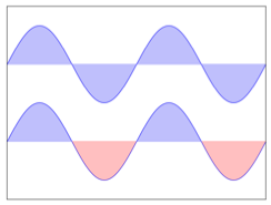
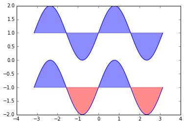
By using the codes below and by reading the documentation, try to reproduce the associated figure.
Regular plot#
Hint : Check the command fill_between
Image("ex-01-regular.png")
n = 256
X = np.linspace(-np.pi, np.pi, n, endpoint=True)
Y = np.sin(2 * X)
plt.plot(X, Y + 1, color='blue', alpha=1.00)
plt.plot(X, Y - 1, color='blue', alpha=1.00)
plt.fill_between(X, 1.0, Y+1, color='blue', alpha=0.45)
plt.fill_between(X, -1.0, Y-1, Y-1>-1, color='blue', alpha=0.45)
plt.fill_between(X, -1.0, Y-1, Y-1<-1, color='red', alpha=0.45)
<matplotlib.collections.PolyCollection at 0x10ca9dfd0>
Scatter Plot#
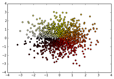
Hint: Color is given by angle of (X, Y). Take care of marker size, color, and transparency.
Image('ex-02-scatter.png')
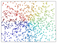
n = 1024
X = np.random.normal(0,1,n)
Y = np.random.normal(0,1,n)
T = np.arctan2(Y, X)
plt.scatter(X,Y, c = T, cmap='hot')
<matplotlib.collections.PathCollection at 0x10ccc80d0>
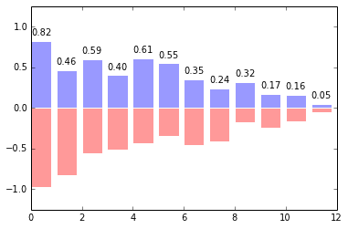
Bar plots#
Take care of text alingment. Add text for red bars.
Image("ex-03-bars.png")
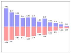
n = 12
X = np.arange(n)
Y1 = (1 - X / float(n)) * np.random.uniform(0.5, 1.0, n)
Y2 = (1 - X / float(n)) * np.random.uniform(0.5, 1.0, n)
plt.bar(X, +Y1, facecolor='#9999ff', edgecolor='white')
plt.bar(X, -Y2, facecolor='#ff9999', edgecolor='white')
for x, y in zip(X, Y1):
    plt.text(x + 0.4, y + 0.05, '%.2f' % y, ha='center', va='bottom')
plt.ylim(-1.25, +1.25)
(-1.25, 1.25)
Contour plots#
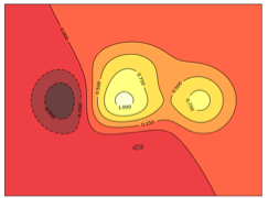
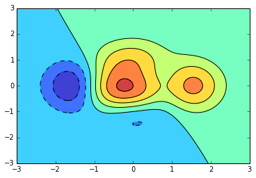
Use the clabel command. You need to check the appropiate colormap.
Image("ex-04-contour.png")
def f(x, y):
    return (1 - x / 2 + x ** 5 + y ** 3) * np.exp(-x ** 2 -y ** 2)
n = 256
x = np.linspace(-3, 3, n)
y = np.linspace(-3, 3, n)
X, Y = np.meshgrid(x, y)
plt.contourf(X, Y, f(X, Y), 8, alpha=.75, cmap='jet')
C = plt.contour(X, Y, f(X, Y), 8, colors='black', linewidth=.5)
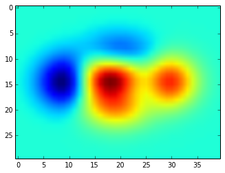
imshow#
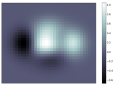
You need to take care of the origin of the image in the imshow command and use te appropriate colorbar
Image("ex-05-imshow.png")
def f(x, y):
    return (1 - x / 2 + x ** 5 + y ** 3) * np.exp(-x ** 2 - y ** 2)
n = 10
x = np.linspace(-3, 3, 4 * n)
y = np.linspace(-3, 3, 3 * n)
X, Y = np.meshgrid(x, y)
plt.imshow(f(X, Y))
<matplotlib.image.AxesImage at 0x1111d7cd0>
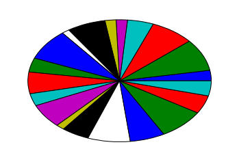
Pie chart#
Hint: Modify Z.
Take care of colors and slices.
Image("ex-06-pie.png")
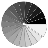
Z = np.random.uniform(0, 1, 20)
plt.pie(Z)
([<matplotlib.patches.Wedge at 0x111a04450>,
  <matplotlib.patches.Wedge at 0x111a04e10>,
  <matplotlib.patches.Wedge at 0x111a317d0>,
  <matplotlib.patches.Wedge at 0x111a1b190>,
  <matplotlib.patches.Wedge at 0x111a1bb10>,
  <matplotlib.patches.Wedge at 0x111a224d0>,
  <matplotlib.patches.Wedge at 0x111a22e50>,
  <matplotlib.patches.Wedge at 0x111a25810>,
  <matplotlib.patches.Wedge at 0x111a2a1d0>,
  <matplotlib.patches.Wedge at 0x111a2ab50>,
  <matplotlib.patches.Wedge at 0x111a2e510>,
  <matplotlib.patches.Wedge at 0x111a2ee90>,
  <matplotlib.patches.Wedge at 0x111a34850>,
  <matplotlib.patches.Wedge at 0x111a3a210>,
  <matplotlib.patches.Wedge at 0x111a3ab90>,
  <matplotlib.patches.Wedge at 0x111a3f550>,
  <matplotlib.patches.Wedge at 0x111a3fed0>,
  <matplotlib.patches.Wedge at 0x111cad890>,
  <matplotlib.patches.Wedge at 0x111cae250>,
  <matplotlib.patches.Wedge at 0x111caebd0>],
 [<matplotlib.text.Text at 0x111a04a10>,
  <matplotlib.text.Text at 0x111a31410>,
  <matplotlib.text.Text at 0x111a31d90>,
  <matplotlib.text.Text at 0x111a1b750>,
  <matplotlib.text.Text at 0x111a22110>,
  <matplotlib.text.Text at 0x111a22a90>,
  <matplotlib.text.Text at 0x111a25450>,
  <matplotlib.text.Text at 0x111a25dd0>,
  <matplotlib.text.Text at 0x111a2a790>,
  <matplotlib.text.Text at 0x111a2e150>,
  <matplotlib.text.Text at 0x111a2ead0>,
  <matplotlib.text.Text at 0x111a34490>,
  <matplotlib.text.Text at 0x111a34e10>,
  <matplotlib.text.Text at 0x111a3a7d0>,
  <matplotlib.text.Text at 0x111a3f190>,
  <matplotlib.text.Text at 0x111a3fb10>,
  <matplotlib.text.Text at 0x111cad4d0>,
  <matplotlib.text.Text at 0x111cade50>,
  <matplotlib.text.Text at 0x111cae810>,
  <matplotlib.text.Text at 0x111cab1d0>])
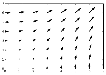
Quiver#
Hint: You need to draw arrows twice
Take care of colors an orientations.
Image("ex-07-quiver.png")
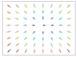
n=8
X, Y = np.mgrid[0:n, 0:n]
plt.quiver(X, Y)
<matplotlib.quiver.Quiver at 0x111cb40d0>
Grids#
Take care of linestyles
Image("ex-08-grid.png")
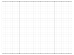
axes = plt.gca()
axes.set_xlim(0, 4)
axes.set_ylim(0, 3)
axes.set_xticklabels([])
axes.set_yticklabels([])
[]
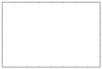
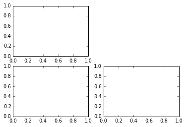
Multiplots#
Hint: You can use several subplots with different partitions
Image("ex-09-multiplots.png")

plt.subplot(2, 2, 1)
plt.subplot(2, 2, 3)
plt.subplot(2, 2, 4)
<matplotlib.axes.AxesSubplot at 0x111a45ad0>
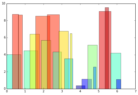
Polar plots#
Hint: You only need to modify the axes line.
Image("ex-10-polar.png")
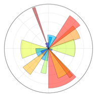
plt.axes([0, 0, 1, 1])
N = 20
theta = np.arange(0., 2 * np.pi, 2 * np.pi / N)
radii = 10 * np.random.rand(N)
width = np.pi / 4 * np.random.rand(N)
bars = plt.bar(theta, radii, width=width, bottom=0.0)
for r, bar in zip(radii, bars):
    bar.set_facecolor(cm.jet(r / 10.))
    bar.set_alpha(0.5)
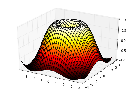
3D Plots#
Hint : You need to use contourf
Image("ex-11-3d.png")
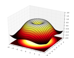
from mpl_toolkits.mplot3d import Axes3D
fig = plt.figure()
ax = Axes3D(fig)
X = np.arange(-4, 4, 0.25)
Y = np.arange(-4, 4, 0.25)
X, Y = np.meshgrid(X, Y)
R = np.sqrt(X**2 + Y**2)
Z = np.sin(R)
ax.plot_surface(X, Y, Z, rstride=1, cstride=1, cmap='hot')
<mpl_toolkits.mplot3d.art3d.Poly3DCollection at 0x1125e8d90>
Making an animation#
There are several ways to make an animation. One can, for example, print several copies of the figure at different times and then enconde them in a video. Or make just a live animation in the notebook, without storing it. Let’s do the later REF:
import matplotlib.pyplot as plt
import numpy as np
%matplotlib inline
# First set up the figure, the axis, and the plot element we want to animate
fig = plt.figure()
ax = plt.axes(xlim=(0, 2), ylim=(-2, 2))
line, = ax.plot([], [], lw=2)
# initialization function: plot the background of each frame
def init():
    line.set_data([], [])
    return line,
# animation function.  This is called sequentially
x = np.linspace(0, 2, 1000)

def animate(i):
    y = np.sin(2 * np.pi * (x - 0.01 * i))
    line.set_data(x, y)
    return line,
from matplotlib import animation

# call the animator.  blit=True means only re-draw the parts that have changed.
anim = animation.FuncAnimation(fig, animate, init_func=init,
                               frames=200, interval=20, blit=True)
anim.save('basic_animation.mp4', fps=30)
import numpy as np
import matplotlib.pyplot as plt
import matplotlib.animation as animation

def data_gen():
    t = data_gen.t
    cnt = 0
    while cnt < 1000:
        cnt+=1
        t += 0.05
        yield t, np.sin(2*np.pi*t) * np.exp(-t/10.)
data_gen.t = 0

fig, ax = plt.subplots()
line, = ax.plot([], [], lw=2)
ax.set_ylim(-1.1, 1.1)
ax.set_xlim(0, 5)
ax.grid()
xdata, ydata = [], []
def run(data):
    # update the data
    t,y = data
    xdata.append(t)
    ydata.append(y)
    xmin, xmax = ax.get_xlim()

    if t >= xmax:
        ax.set_xlim(xmin, 2*xmax)
        ax.figure.canvas.draw()
    line.set_data(xdata, ydata)

    return line,

ani = animation.FuncAnimation(fig, run, data_gen, blit=True, interval=10,
    repeat=False)
plt.show()
